THE CLOCK PROJECT
2ND YEAR STUDIO- SOLO PROJECT
a serious clock.
This was our first project moving out of abstract application of skills and creating something that looked like a real product!
For this project our professors assigned each person in our studio an adjective. Our objective was to use this adjective to create a visual language for a tabletop clock, and then create a high-fidelity mockup of our final design.
My word? serious.
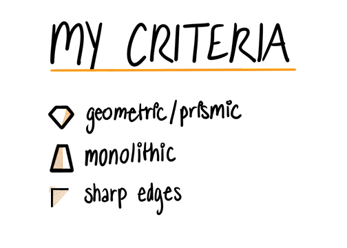
what makes a serious clock?
This one was a challenge for me. I equated serious with boring or bland. I began looking to things in the world around me that had a similar impression and the characteristics of those things.
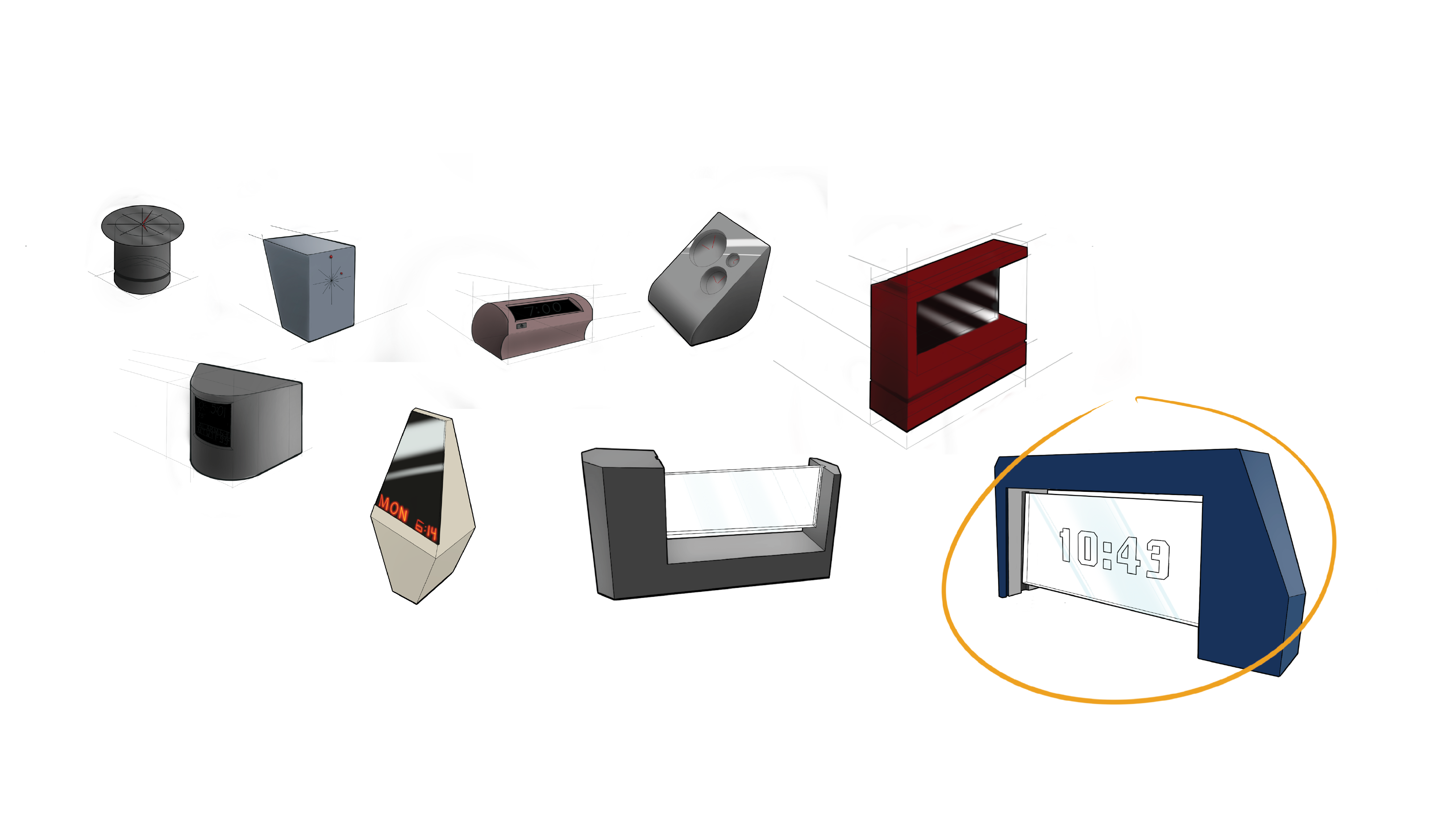
sketching to explore
Hey there, this is the default text for a new paragraph. Feel free to edit this paragraph by clicking on the yellow edit icon. After you are done just click on the yellow checkmark button on the top right. Have Fun!
I moved into sketching with these criteria in mind, exploring color of the clock body and face, form for tabletop viewing and aesthetic, and finish to align the clock with my "serious" brand.
With this criteria in mind, I started sketching to explore color of the clock face and body, form for orientation and aesthetics, and finish to align the clock with my "serious" brand.
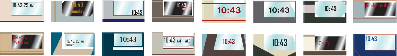
some serious numbers.
On a traditional digital clock face, the time that shows every stroke is 10:43. I took these digits into Adobe Illustrator and iterated on color, style, and placement of the time display for the clock face.
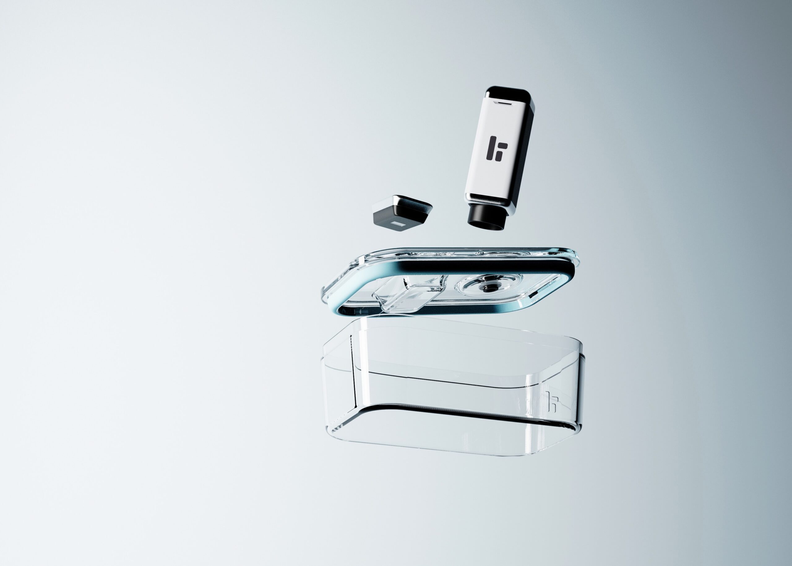
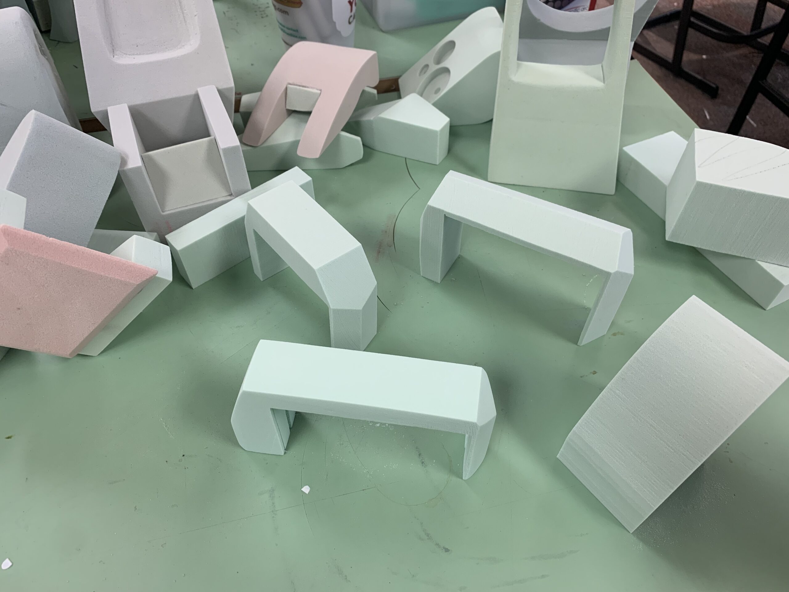
form with foam.
I received critique on my ideation and moved with this mind into modeling with protofoam.
This was very helpful in understanding the physical aspects of a tabletop clock. Modeling was crucial in understanding the user interaction with a tabletop clock for features like scale and readability.
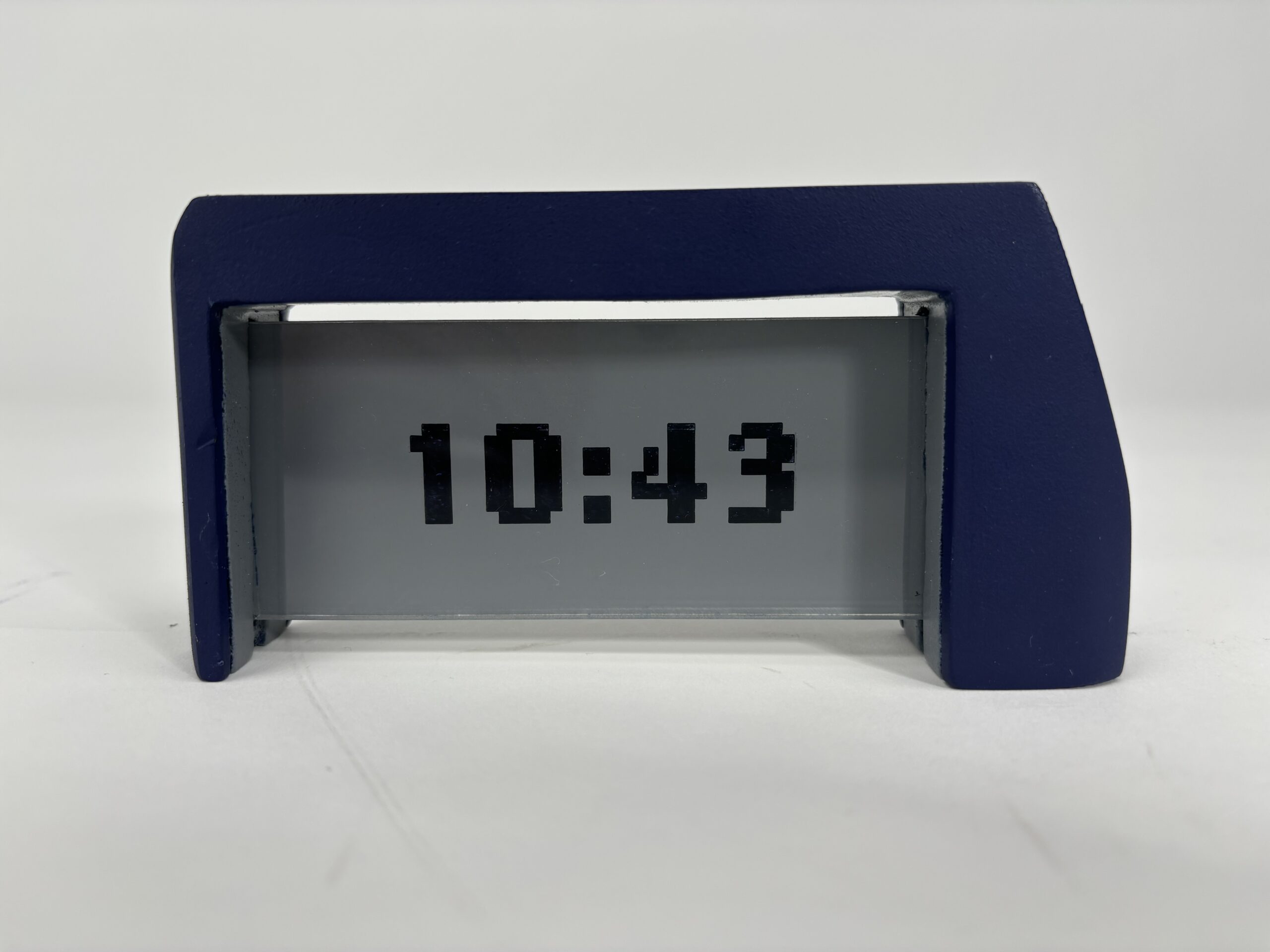
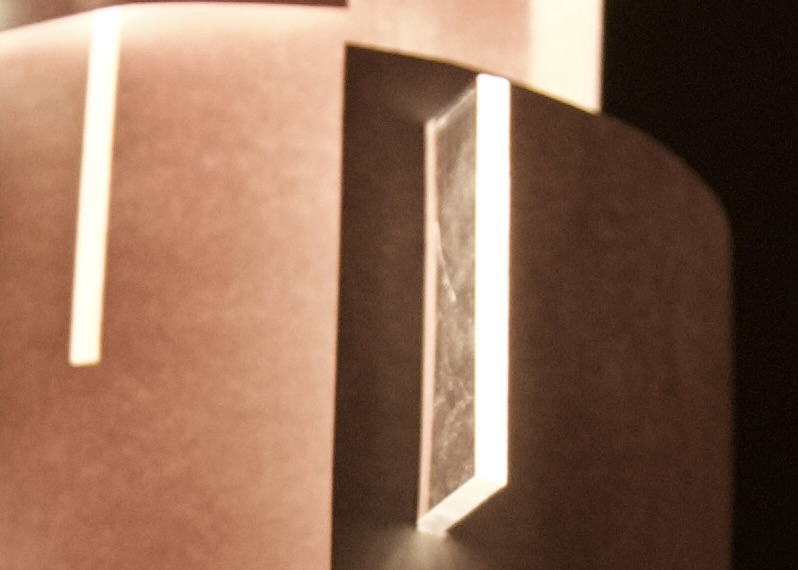
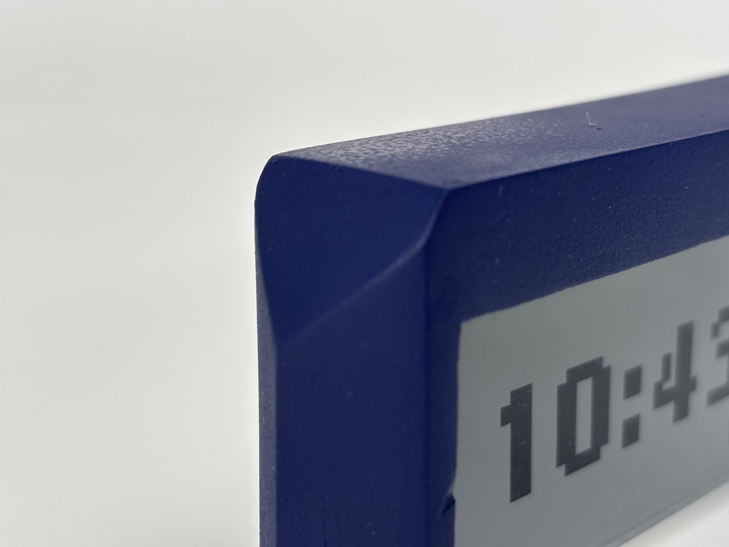
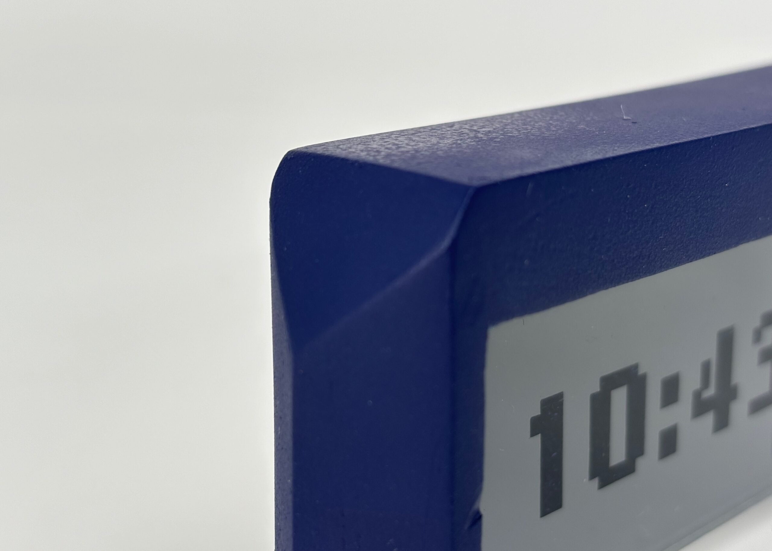
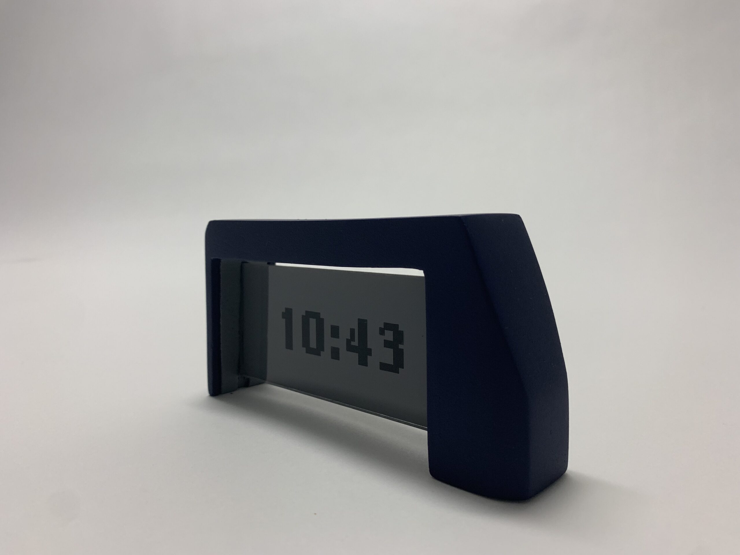
the serious clock.
The final model features an acrylic screen etched with the digits in a pixellated style. The clock body is a deep blue, in sharp contrast with the lighter gray screen. The screen slides into the notch in the center of the structural piece of the clock with a small gap at the top, creating a sophisticated floating effect.
This piece has angled planar surfaces at the top corners, giving the clock a prismic effect. The asymmetry between the sides creates visual interest while maintaining the vertical that lends itself to the word "serious".

Selected Works